Friday, 11 March 2016
Shop UI Designs
Here are three shop UI designs done for the shop UI, feedback is required in order to choose a final design, all elements have been saved separately in order to choose a final design, before getting feedback I the scale needs to change drastically, the team prefer the first design better, however, we need more feedback, I took elements and design styles from the in game UI to stay within the same style:
Daniel's Targets 11/03/2016
Rocket Launcher Update:
Oculus Main Menu:
Main Menu with Controller + Mouse Problems:
The controller doesn't work unless the mouse is focused on the UI, if the mouse is focused on the UI, then the mouse is constantly visible, I got the mouse to remove itself from visibility when its staying still, but only if I hold left click whilst doing so (for some unknown reason). But if the mouse is to be hidden, it's not focused on the UI, thus, the controller cannot be used until I click the UI again.
Final player arms version
Labels:
Arms,
Paul,
Player Character,
Retopology,
Rigging,
Skinning
Environment Texture Update
Original Stream textures now Sludge:
Original Sludge textures now Stream:
Engine:
Stream:
Sludge:
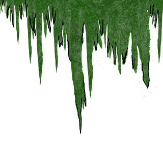
Might change these textures back how they were or not i dunno cant make my mind up.Some of the textures need sorting out anyways.Below are the alphas images for the bush and hanging moss.Used the leaves I had already just tweaked them slightly to make the bush .
Bush:
Hanging Moss:
Monday, 7 March 2016
Targets 07/03/2016
Daniel -
Make the mouse only appear on the shop when the mouse is moved
Make the mouse show on the main menu, controller integration
Make the Rocket Launcher more effective, switch from a radial damage system to a collision based system
Aaran -
Implement the loading screen
Improve the Main Menu UI
Rhys -
Fix the water textures.
Paul -
Retopologise the arms and rig / skin them ready for animations
Friday, 4 March 2016
Player Arms V2
Reworked the arms in ZBrush and retopologised them. Hopefully these ones will work a lot better with the topology, and should animate better with the guns.
Labels:
Arms,
Modelling,
Paul,
Player Character,
Retopology,
Rework,
ZBrush
Thursday, 3 March 2016
UI Testing & Final UI Design
3rd Year Games Design
Testers
Flamingo
Ninja – Prefers central health bar
Mike
– Prefers left health bar
Rhys
– Prefers central health bar
Kyle
– Prefers central health bar
Add orange visors to the bottom captions like ammo and damage multiplier so it stands out more and fits in with the helmet theme.
Add orange visors to the bottom captions like ammo and damage multiplier so it stands out more and fits in with the helmet theme.
2nd Year Games Design Testers
3
Preferred central health bar as it fits the theme of having a helmet, fits the
shape better.
Remove
battery as it’s deceiving, makes the player think they’re losing energy and
that it’s there for a reason.
Automotive Design Testers
2
Preferred left hand side health bar as its more subtle, central one got in the
way a bit more, central health bar reminded them of fighting games, mortal
kombat etc… same sort of position and didn’t fit a fps as much.
Other Feedback
Fix
Portal – Reset Issue
Portal
only works sometimes, in the spire area it crashes and spawns player in
tutorial room atop one of the crates.
Problem Solution?
Dan
found out that the ui test png image we brought into the game was a solid object and was colliding with the shop which blocked certain selections, in this case, it blocked exiting the shop. The
variable was just set wrong for the portal which was set from a test before which allowed the portal to only work sometimes and spawn the player back to the crate.
UI Test Video:
Here is a video of the central health bar user interface in engine, this was the chosen ui for the game, I then saved it as different components and made changes according to feedback in the following images:
UI Test Video:
Here is a video of the central health bar user interface in engine, this was the chosen ui for the game, I then saved it as different components and made changes according to feedback in the following images:
Video:
Here is the final loading screens, we had the candidates choose a preferred loading screen, every person agreed on the black outlines with the ripped effects behind the image looking better, they shall be implemented alongside Karthos' health bar:
Subscribe to:
Comments (Atom)


